Title: ‘Underground Ghosts’
Kit Used:
Olympus E-400 with 14-42mm Lens
Technical Data:
Exposure: Manual
Shutter Speed: 1/6 sec
Aperture: f/5.6
ISO: 400
Focal Length: 14mm
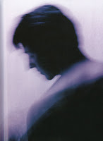
I visited London for a long weekend with the idea of capturing ‘moving’ people in the busy London Underground. The Underground for me is an amazing place; it has a great feeling of the old meeting the new, with Victorian tile clad walls, piped ceilings and modern advertising boards and literally thousands of people of all walks of life moving through it constantly, everyday.
It can get very busy, but this was to my advantage, as I didn’t have to wait around to capture shots of people moving and waiting for the screeching tube.
To shoot the people in the Underground I played with a few shutter speeds and ISO numbers until I found something that worked fairly consistently. I then shot almost all of the images not looking through the viewfinder, but with the camera casually hanging from the neck strap. This could be seen as a ‘hit and miss’ approach, but having taken some test shots and with plenty of memory on my compact flash card, I still had to consider good composition and capture the moment as it happened. I tried this method as I wanted to keep a low profile and to not draw attention, which I would have certainly got if I was holding the camera up to my eye.
In Photoshop I post processed the image and created three different looks from the one shot; colour, black and white and a colour ‘pop’ version. I thought each variation worked well and goes someway to show what you can get out of a single photo!
Photoshop Process
01 Original: I started the process by first converting the image to an 8bit tiff Image>Mode> 8 bits/channel. This allows the TIFF file to be saved out to any of the image formats available in Photoshop, where a 16bit TIFF only has a few formats to choose from.
02 Levels: Next was to create a Levels adjustment layer where only a small change was required.
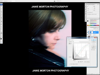
03 Curves: I then created a Curves adjustment layer and used a cross processed (custom) curve to punch more colour into the image. I liked the affect this had on the colours in the iamge helping to pick out the blues in the roof and the red, yellow and green colours of the commuters clothing.
04 Gaussian Blur: Next I applied a Gaussian Blur filter to help reduce some of the noise or grain in the image. To do this I made a duplicate of the background and named this layer ‘Gaussian Blur’. I then applied the Gaussian Blur Filter, found in Filter>Blur> Gaussian Blur and entered a value of 0.7 in the radius field.
I was happy with the processes made to the image so far and so I saved out a high quality JPEG of this version (colour).
05 Black&White: I wanted to create a black and white version of the shot, as I thought this effect would work well. I tried the Black & White adjustment layer instead of the Channel Mixer to convert the image, which is a useful alternative. Like the Channel Mixer you move sliders to adjust the colour tones of the image.
06 Black&White-SelectColour: I also applied a ‘Tint’ to the image by selecting the Tint checkbox and then selecting the colour swatch. From the target colour window I chose a Grey/Blue colour, which I liked the look of, as it matched the industrial feel of the underground.
I was happy with these changes and the look of the Black and White image. I saved out a high quality JPEG of this version (B&W).
07 ColourPop: Finally, I wanted to see how some colour ‘popping’ would work within the image and so I duplicated the Black & White layer and deleted the layer mask, by right clicking the white layer box. Hiding the original Black & White adjustment layer, I then created a layer mask from Layer>Layer Mask> and selected 'Reveal All'. The colour swatches in the Tools panel change to black/white when this is applied. Selecting the black colour swatch will reveal the image (pixels) and the white colour swatch will hide them.
I selected the Brush from the tool panel and set the opacity to 40%, to only reveal some of the pixels and painted over the area I wanted to 'pop' out. This gave the yellow of the ladies jacket the muted tone I was after.
I was happy with the colour pop effect and I saved out a high quality JPEG of this version (colour pop). I now had three versions from the one shot, which i could use towards the photography course and apply the techniques i learned and used for future projects.
Thank you for reading!


